Tinybird Changelog: New User Experience for Data Exploration
During the last few weeks we’ve been studying the best way of building and organizing large applications using Tinybird Analytics, and, in addition to a few ...

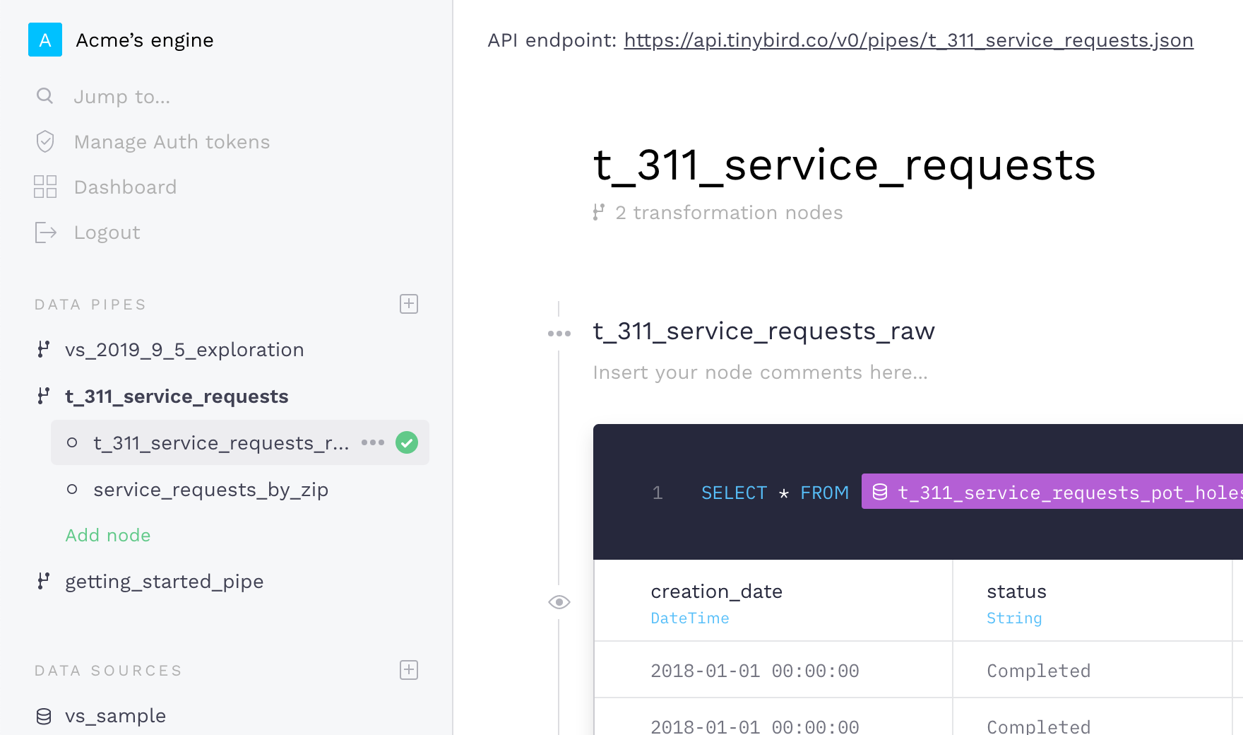
During the last few weeks we’ve been studying the best way of building and organizing large applications using Tinybird Analytics, and, in addition to a few improvements to our APIs, we’ve completely redesigned the User Interface of the Data Pipes screen.
Although in our old UI we were focusing on speed and rapid prototyping, we were missing a bit of context and a quick way of navigating through the account content.
We’ve designed a sidebar to accommodate more contextual information and faster ways of navigating through the nodes of a Data Pipe, as well as between different Data Pipes. Also, you will be able to find your recently used Data Sources in the sidebar so you can always preview the information you are working with when building your queries.
The new version of the UI comes also with some changes in the way we present the transformation nodes of a Data Pipe. From now on, users will be able to collapse any part of the node so that the whole Data Pipe reads better, and get access to all the node options through a contextual menu to the right of the node name.
The new UI has improved substantially the way we use Tinybird Analytics when working with our clients and for our own internal data projects, so we hope you enjoy it as well. As always we are looking for feedback, so if you don’t have a Tinybird Analytics account yet and have CSVs to explore or Data to analyze, go ahead and join our waiting list!