Operational Analytics in Real Time with Tinybird and Retool
Three steps to create a Retool app or dashboard in minutes to display your operational analytics in real time.
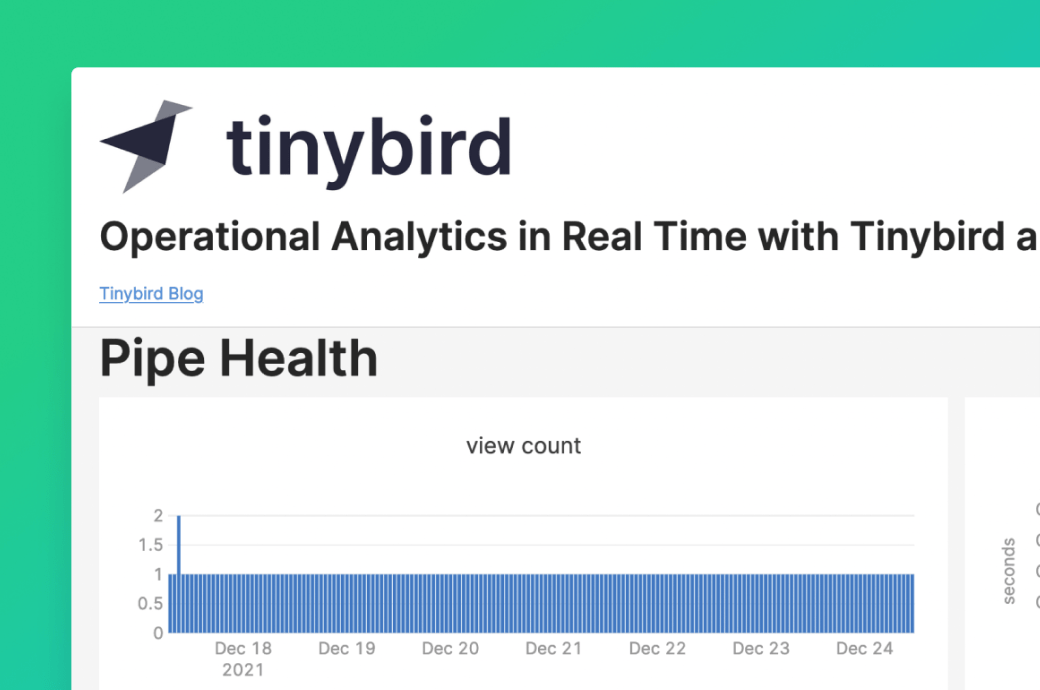
You ingest your data to Tinybird and run analyses; delivering realtime answers at scale through analytical API endpoints built in minutes. It’s then entirely up to you how you consume the JSON documents or CSV files resulting from the API endpoints.
If those realtime answers are insights from your operational analytics then being able to quickly and easily create an app or dashboard to display your results to colleagues makes those insights actionable. Within Tinybird, one of the ways we do this is with Retool, which is a fast way to build fully featured internal tools on top of REST APIs. With Retool you build apps by dragging and dropping pre-built components and access data from your Tinybird API Endpoints using the GET method.
Let’s look in detail at an example of using Retool to select a parameter, query an endpoint and then chart the results.
This app will plot some of the live operational data that monitors the performance of your Tinybird API endpoints and Data Sources. This is a great example of how to monitor your Tinybird account in real time, but of course you can also create apps to monitor other business data from your API endpoints so that you always know how your business is doing.
To create an app we have a three-step process:
- ingest data to Tinybird
- create a Tinybird API endpoint
- create a Retool app.
1. Ingest Data to Tinybird
To create your Data Sources directly from the Tinybird UI you can ingest data from local CSV or NDJSON files, remote URLs or Kafka data streams.
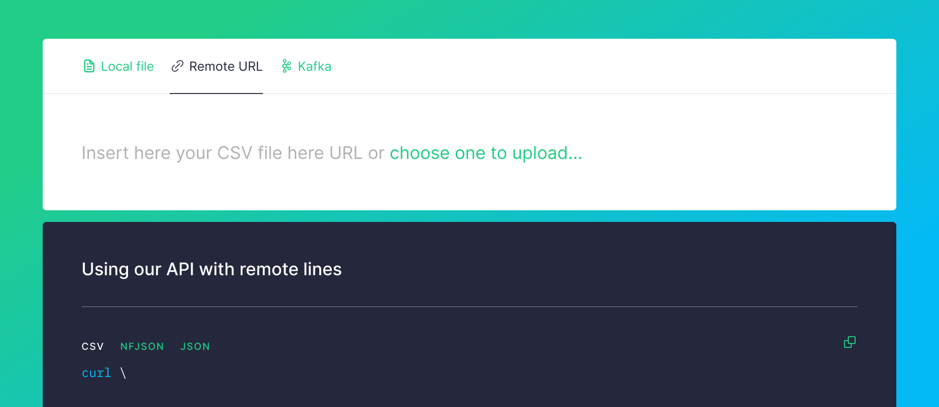
But for this example, since we will be using Tinybird’s Service Data Sources you won’t need to ingest any data. These Data Sources are provided by Tinybird so that you can inspect what’s going on in your account. They give you real time stats about API calls or a log of every operation over your Data Sources, Pipes, endpoints and more.
2. Create a Tinybird API Endpoint
Every request to a pipe is logged to tinybird.pipe_stats_rt and kept in this Data Source for the last week. This service Data Source can be used to monitor pipe health. These are the columns:
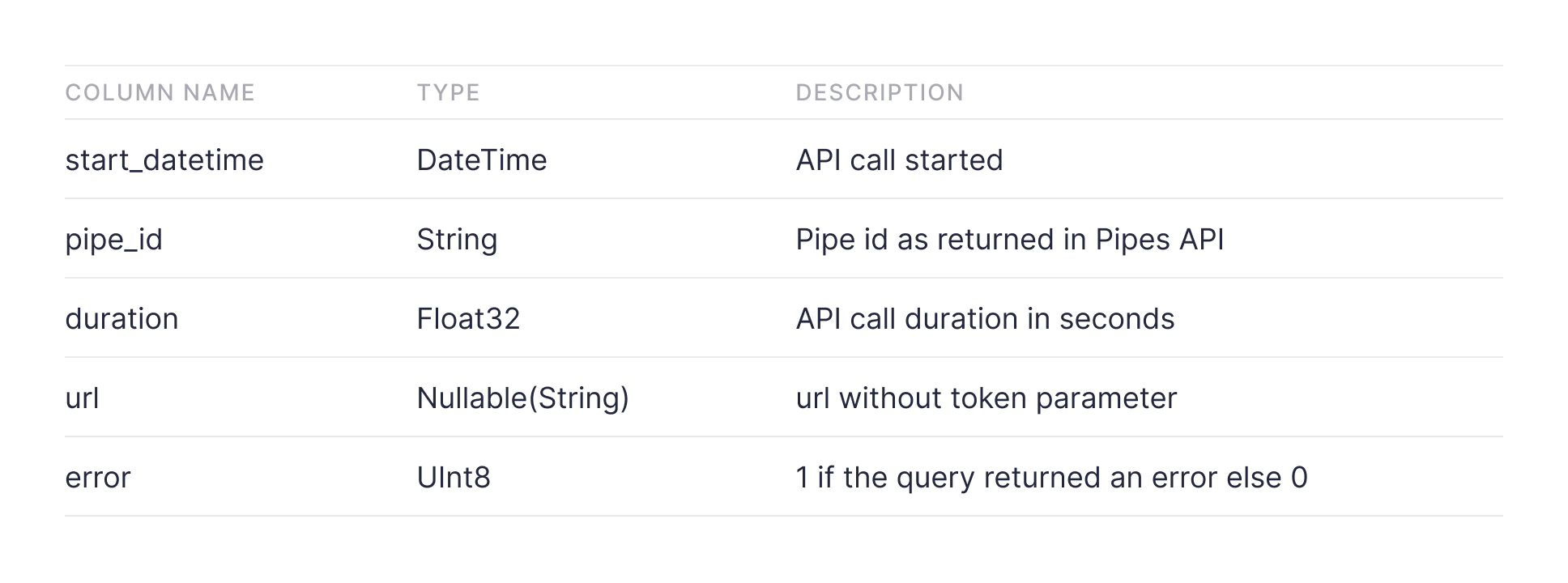
The example API endpoint aggregates the statistics for each hour for the selected pipe.
All we need to do now is put the URL of the API endpoint into Retool.
3. Create a Retool app
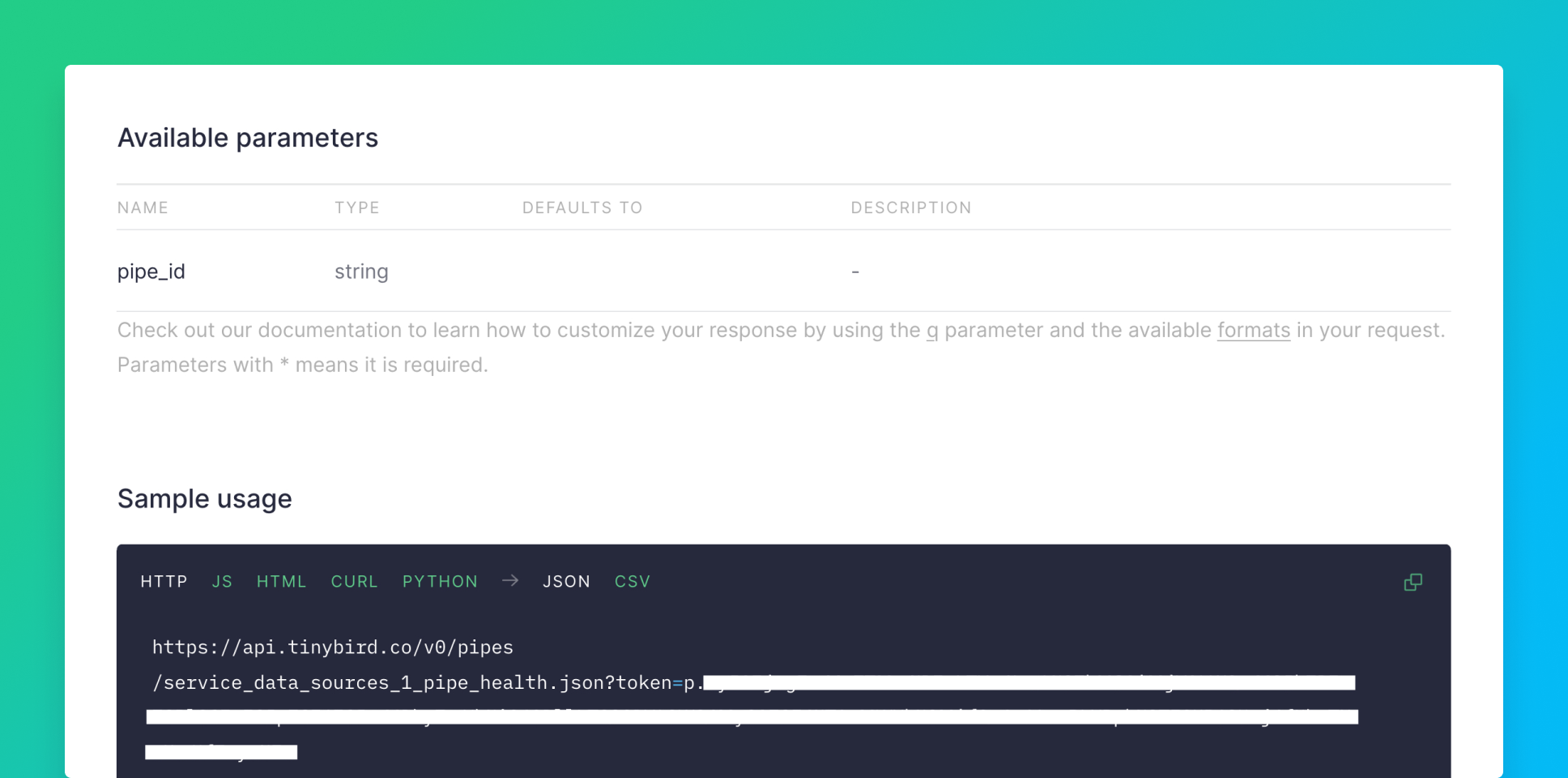
First, copy the HTTP JSON Sample usage from the API Endpoint page in the Tinybird UI, then create a New ‘Resource Query’, and paste the URL into the ‘Resource’ RESTQueryAPI with ‘Action type’ GET. Here the ‘Resource Query’ is named ´pipe_health´.
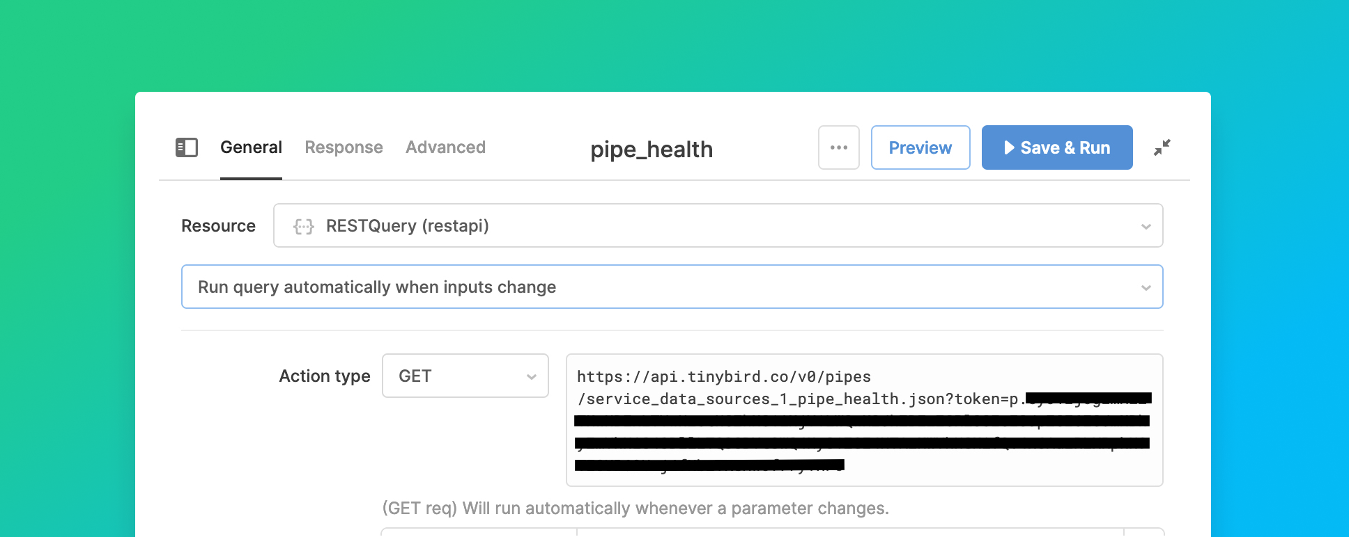
Then we ‘Insert’ a ‘Select’ component onto the Retool canvas with the pipe_ids of the pipes we want to monitor as ‘Values’ and the user-friendly pipe names as ‘Labels’. The pipe names will appear in a dropdown list. The pipe_ids can be found on the VIEW API page. Now add pipe_id={{select.value}}& as a parameter to the URL in the Resource Query, either directly in the URL or a the URL parameters box:
https://api.tinybird.co/v0/pipes/pipe_health.json?pipe_id={{select.value}}&token=…
The JSON from this endpoint can then be used to create charts directly from the UI or using the full power of Plotly JSON.
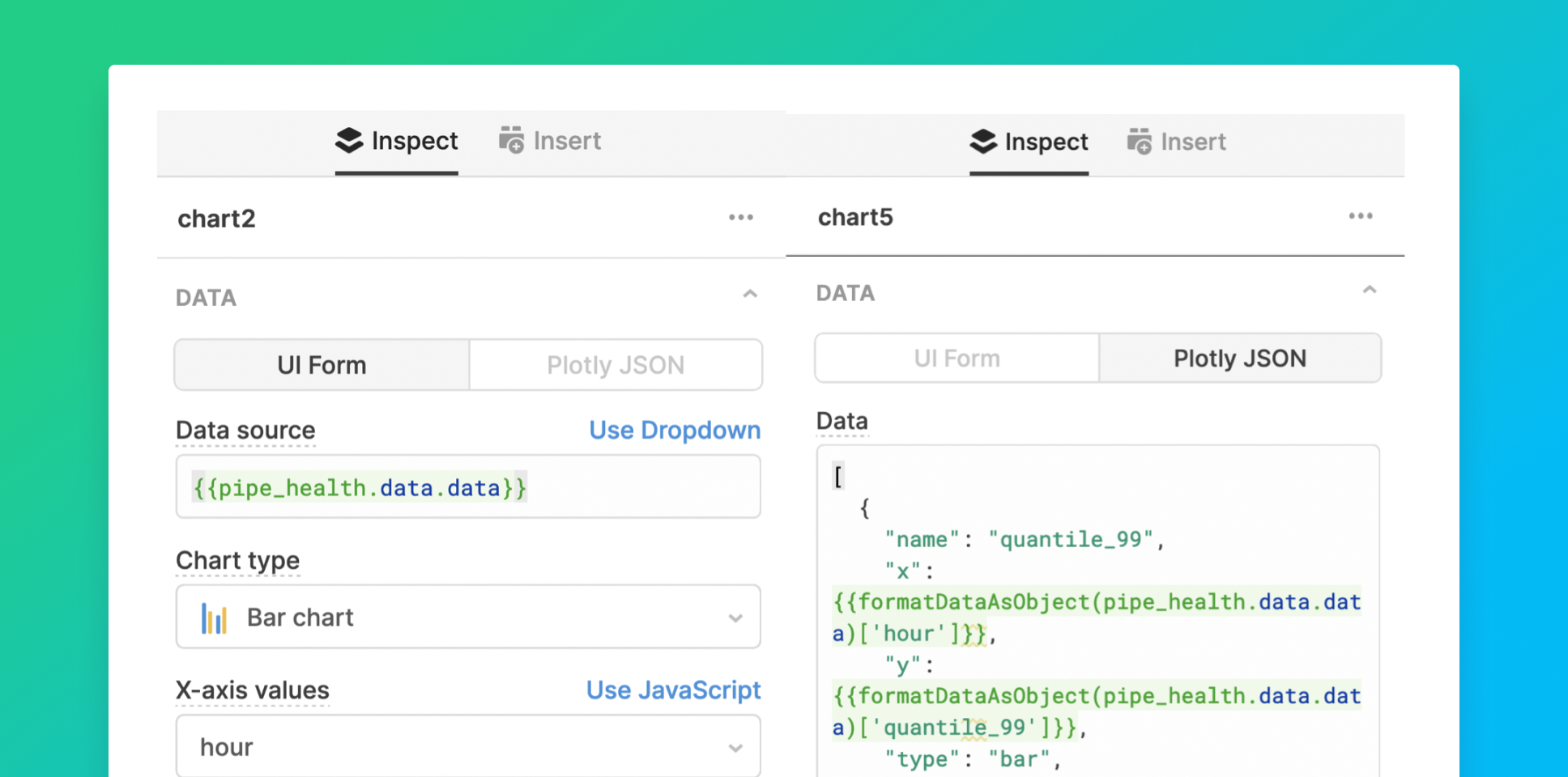
That’s all it takes to build an app where you can interactively select your pipe and chart key performance statistics.
The beauty of this approach is that with Tinybird as the back-end, you have direct access to your operational analyses and using a low-code solution can present your results to everybody in a way that is visually impactful.
Adding more charts is straightforward. For example, we can repeat the process with the tinybird.datasources_ops_log to build charts monitoring ingestion times and rows ingested. This log tracks all operations (create, append, replace, delete, truncate and rename) performed on your Data Sources.
Here’s how the queries for the API endpoints look:
Then create each chart in Retool as before:
- new query
- paste in the URL
- add a chart component
- optionally, add selection components and the URL parameters.
The chart of ingestion times shows data for the hour prior to the date and time selected with the default value as now (here now is UTC+1). The Data Source timestamps are in UTC.
start_date={{dateTime1.formattedValue}}{{moment().format("YYYY-MM-DD HH:mm:ss")}}
The chart of rows ingested shows data for the selected range of dates, with the default values as the last month.
start_date={{dateRange1.value.start}}&end_date={{dateRange1.value.end}}{{moment().subtract(1, "months").format("YYYY-MM-DD")}}{{moment().format("YYYY-MM-DD")}}.
This is how the resulting app looks:
You can try it out here.
If you have an interesting use case, write to us at hi@tinybird.co, sign up to Tinybird and easily build your own data apps. If you already have an account, why don’t you build an app in Retool and showcase your work in our community Slack? Looking forward to seeing you there.
